
Excel charts are commonly used to visually represent and depict the data in the spreadsheets. You can create a variety of charts in Excel, such as, line, bar, pie, doughnut, pyramid, bubble, etc. In this article, you will learn how to create charts in Excel files in Python. We will create a few charts to demonstrate how easy it is for you to plot Excel charts using Python.
- Python Library to Create Charts in Excel - Free Download
- Easy Steps to Create Excel Charts in Python
- Supported Excel Chart Types
- Create a Chart in Excel in Python
- Plot a 3D Column Chart in Excel
- Generate a Pie Chart in Excel
- Plot a Bubble Chart in Excel
- Get a Free License
Python Library to Create Charts in Excel - Free Download
To create charts with Excel data in Python, we’ll use Aspose.Cells for Python. It is a feature-rich library that lets you implement Excel automation in Python applications. Furthermore, it allows you create a variety of charts seamlessly. You can install it into your Python applications from PyPI using the following command.
pip install aspose-cells
How to Create Charts in Excel in Python
Aspose.Cells for Python simplifies the process of creating Excel charts programmatically in Python. The following are the basic steps that are required to create each chart type in Excel using Aspose.Cells for Python.
- Load the Excel file or create a new workbook.
- Insert data into the workbook (if empty).
- Select a worksheet and add chart of the desired type.
- Add data range to the chart.
- Save the Excel file to desired location.
Supported Excel Chart Types
Aspose.Cells for Python provides a complete set of standard chart types. The list includes, but not limited to:
- Column
- ColumnStacked
- Column100PercentStacked
- Column3DClustered
- Column3DStacked
- Column3D100PercentStacked
- Column3D
- Bar
- BarStacked
- Bar100PercentStacked
- Bar3DClustered
- Bar3DStacked
- Bar3D100PercentStacked
- Line
- LineStacked
- Line100PercentStacked
- LineWithDataMarkers
- LineStackedWithDataMarkers
- Line100PercentStackedWithDataMarkers
- Line3D
- Pie
- Pie3D
- PiePie
- PieExploded
- Pie3DExploded
- PieBar
- Scatter
- ScatterConnectedByCurvesWithDataMarker
Create a Chart in Excel XLS in Python
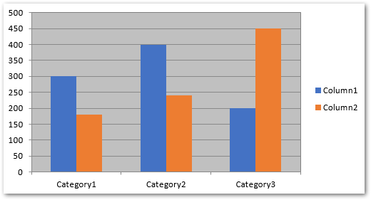
Let’s now have a look at how to transform the above-mentioned steps into Python to generate a chart in an Excel worksheet. For demonstration, let’s create a column chart.
- First, create a new Excel workbook or load an existing one using Workbook class.
- Get reference of the desired worksheet into an object.
- Insert data into the worksheet (if worksheet is empty).
- Create a chart in the worksheet using Worksheet.getCharts().add(type, upperLeftRow, upperLeftColumn, lowerRightRow, lowerRightColumn) method.
- Get reference of the chart by its index into an object.
- Set data source for the chart using Chart.setChartDataRange(range, bool) method.
- Finally, save the workbook using Workbook.save(string) method.
The following code sample shows how to create an Excel chart in Python.
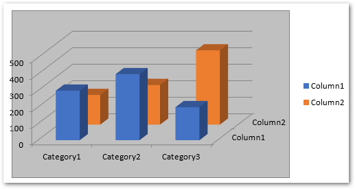
Python: Create a 3D Column Chart in Excel
To create the 3D column chart in Excel, you only need to specify the ChartType.COLUMN_3_D type in Worksheet.getCharts().add() method. The rest of the steps will be the same as mentioned in the previous section.
The following code sample shows how to plot a 3D column chart in Excel in Python.
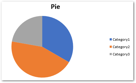
Generate a Pie Chart in Excel using Python
For creating a pie chart, simply pass ChartType.PIE type while adding the chart to the worksheet. You can insert data into the sheet dynamically or add it before loading the Excel file.
The following code sample shows how to insert a pie chart in Excel in Python.
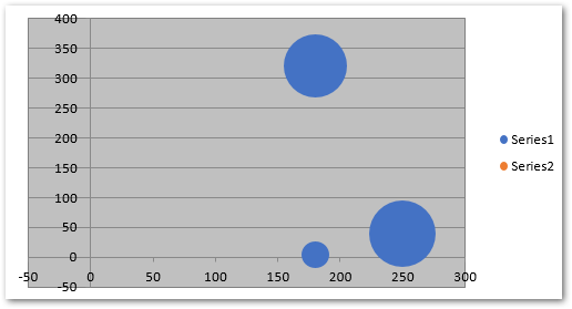
Plot a Bubble Chart in Excel in Python
For creating a bubble chart in Excel, you will need to pass ChartType.BUBBLE in Worksheet.getCharts().add() method. Furthermore, you also have to add the data range to the chart series. In addition, you can set the bubble size and X and Y coordinates’ values.
The following code sample shows how to plot a bubble chart in Excel in Python.
Plotting Other Excel Chart
You can also create other types of charts in a similar fashion using Aspose.Cells for Python. Simply use the appropriate chat type and set additional options specific to each type.
Python Library to Plot Charts in Excel - Get a Free License
You can try Aspose.Cells for Python without evaluation limitations by getting a free temporary license.
Conclusion
In this article, you have seen how to create charts in Excel files in Python. With the help of code samples, we have demonstrated how to plot column, 3D column, pie and bubble charts in Excel in Python. For more details, you can visit the documentation of the library. In case you would have any queries, contact us via our forum.